WebSourceCode, responsive web development.
An introducing line here! You can use blue.
An introducing line here! You can use gray.
This is the style-playground! It shows how different elements of this template are formatted and can be used as a reference when using the template to style your own website.
This responsive layout uses the grid system that allows the content to flow into position.
Cascading Style Sheets (CSS) is a style sheet language used to describe the presentation semantics (the look and formatting) of a document written in a markup language.
The following are examples of header formats:
This paragraph shows how all text encapsulated only within <p></p> tags will appear.
More text examples are as follows:
This is emphasised text
This is strong text
This is deleted text
This is a link
This is a block of code

        This is a block of code

        This is a block of code
"This is a styled quote. Lorem ipsum dolor sit amet, consectetuer adipiscing elit. Duis tempor. Nullam tortor. Nulla vel dui. Curabitur et metus. This is a quote. Lorem ipsum dolor sit amet, consectetuer adipiscing elit. Duis tempor. Nullam tortor. Nulla vel dui. Curabitur et metus." John Doe (1900 - 2000)
The following are examples of image formats:
 A left aligned image. Lorem ipsum dolor sit amet, consectetuer adipiscing elit. Sed viverra tortor non dolor. Donec nulla libero, ullamcorper sed, consequat dignissim, luctus blandit, sapien. In ante. Proin aliquam odio ut sem. Lorem ipsum dolor sit amet, consectetuer adipiscing elit. Consequat dignissim, luctus blandit, sapien. In ante. Proin aliquam odio ut sem consequat dignissim, luctus blandit, sapien. In ante. Proin aliquam odio ut sem. Lorem ipsum dolor sit amet, consectetuer adipiscing elit.
 A right aligned image. Lorem ipsum dolor sit amet, consectetuer adipiscing elit. Sed viverra tortor non dolor. Donec nulla libero, ullamcorper sed, consequat dignissim, luctus blandit, sapien. In ante. Proin aliquam odio ut sem. Lorem ipsum dolor sit amet, consectetuer adipiscing elit.
 A left aligned, linked image. Lorem ipsum dolor sit amet, consectetuer adipiscing elit. Sed viverra tortor non dolor. Donec nulla libero, ullamcorper sed, consequat dignissim, luctus blandit, sapien. In ante. Proin aliquam odio ut sem. Lorem ipsum dolor sit amet, consectetuer adipiscing elit.
These are some very basic tabs. There are some downsides with tabs in responsive layouts - in small screens they will stack over each other. Make sure to test how it looks like when you want to use them. Don´t use too long titles.
These are some very basic tabs. There are some downsides with tabs in responsive layouts - in small screens they will stack over each other. Make sure to test how it looks like when you want to use them. Don´t use too long titles.
These are some very basic tabs. There are some downsides with tabs in responsive layouts - in small screens they will stack over each other. Make sure to test how it looks like when you want to use them. Don´t use too long titles.
Data tables and forms don´t always play nice in responsive layouts. They can be flexible in width but to display cell content in a way that is readable and makes sense, they have to have a certain width. There are approaches in the web to deal with that, but that´s an own topic. Search for it if you are in need of larger tables or forms.
| Table header | Table header | Table header | Table header |
|---|---|---|---|
| Cell data | Cell data | Cell data | Cell data |
| Cell data | Cell data | Cell data | Cell data |
| Cell data | Cell data | Cell data | Cell data |
| Table header | Table header | Table header | |
|---|---|---|---|
| Cell data | Cell data | Cell data | Cell data |
| Cell data | Cell data | Cell data | Cell data |
| Cell data | Cell data | Cell data | Cell data |
To see a form, go here!

This template is responsive! It is based on the Inuit-framework. You can extend the framework with igloos - have a look at the website!
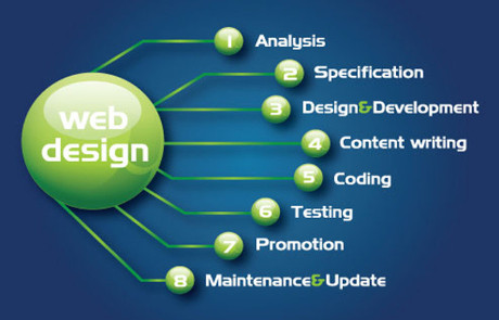
Comprehensive design process that does not cut any corners.

Impress your audience with a stunning visualization of your product.

We can use your graphics or create a custom set for you.